

Font 속성
font-weight
- 글자의 두께를 정하는 속성
normal, 400 : 기본 두께
bold, 700 : 두껍게
bolder : 상위 요소보다 더 두껍게
lighter : 상위 요소보다 더 얇게
100~900 : 100단위의 숫자 9개, normal과 bold 이외 두께
<!DOCTYPE html>
<html lang="en">
  <head>
    <meta charset="UTF-8" />
    <meta http-equiv="X-UA-Compatible" content="IE=edge" />
    <meta name="viewport" content="width=device-width, initial-scale=1.0" />
    <title>Document</title>
    <style>
     .normal{
      font-weight: normal;
     }
     .bold{
      font-weight: bold;
     }
     .bolder{
      font-weight: bolder;
     }
     .lighter{
      font-weight: lighter;
     }
     .number{
      font-weight: 200;
     }
    </style>
  </head>
  <body>
   <div class="normal">normal, 400 : 기본 두께</div>
   <div class="bold">bold, 700 : 두껍게</div>
   <div class="bolder">bolder : 상위 요소보다 더 두껍게</div>
   <div class="lighter">lighter : 상위 요소보다 더 얇게</div>
   <div class="number">100~900 : 100단위의 숫자 9개, normal과 bold 이외 두께</div>

 </body>
</html>
font-size
: 글자의 크기
16px : 기본 크기
단위 : px, ex, rem 등 단위로 지정
% : 부모 요소의 폰트 크기에 대한 비율
smaller : 상위 요소보다 작은 크기
lager : 상위 요소보다 큰 크기
xx-small~xx-large : 가장 작은 크기~ 가장 큰 크기 ,7단
<!DOCTYPE html>
<html lang="en">
  <head>
    <meta charset="UTF-8" />
    <meta http-equiv="X-UA-Compatible" content="IE=edge" />
    <meta name="viewport" content="width=device-width, initial-scale=1.0" />
    <title>Document</title>
    <style>
     .normal{
      font-size: 16px;
     }
     .px{
      font-size: 26px;
     }

     /* 부모 요소 */
     .bolder{
      font-size: 46px;
     }

     .percent{
      font-size: 50px;
     }
     .smaller{
      font-size: smaller;
     }
     .lager{
      font-size: large;
     }
     .level{
      font-size: xx-small;
     }
    </style>
  </head>
  <body>
   <div class="normal">16px : 기본 크기</div>
   <div class="px">단위 : px, ex, rem 등 단위로 지정</div>
   <div class="bolder">
    <div class="percent">% : 부모 요소의 폰트 크기에 대한 비율</div>
    <div class="smaller">smaller : 상위 요소보다 작은 크기</div>
    <div class="lager">lager : 상위 요소보다 큰 크기</div>
    <div class="level">xx-small~xx-large : 가장 작은 크기~ 가장 큰 크기 ,7단</div>
   </div>
 </body>
</html>
line-height
: 한 줄의 높이 (=행간)
normal : 기본 정의
숫자 : 요소의 글꼴 크기의 배수로 지정
단위 : px, em, rem 등의 단위로 지정
% : 요소의 글꼴 크기의 비율로 지정
<!DOCTYPE html>
<html lang="en">
  <head>
    <meta charset="UTF-8" />
    <meta http-equiv="X-UA-Compatible" content="IE=edge" />
    <meta name="viewport" content="width=device-width, initial-scale=1.0" />
    <title>Document</title>
    <style>
     .normal{
      line-height: normal;
     }
     .number{
      line-height: 5;
     }
     .px{
      line-height: 5px;
     }
     .percent
     {
      line-height: 300%
     }
    </style>
  </head>
  <body>
   <div class="normal">
    <p>line-height 속성 중</p>
    <p>normal은 기본 웹 브라우저의 간격입니다.</p><hr/>
   </div>
   <div class="number">
    <p>line-height 속성 중</p>
    <p>숫자는 요소의 글꼴 크기의 배수로 지정됩니다.</p><hr/>
   </div>
   <div class="px">
    <p>line-height 속성</p>
    <p>px, em, rem 등의 단위로 지정가능합니다.</p><hr/>
  </div>
   <div class="percent">
    <p>line-height 속성 중</p>
    <p>%는  요소의 글꼴 크기의 비율로 지정합니다.</p>
  </div>

 </body>
</html>
글꼴 계열
: 필수로 작성!
serif: 바탕체
sans-serif: 고딕체
monospace : 고정너비 글꼴
cursive : 필기체
fantasy : 장식 글꼴
구글, 눈누 폰트 사용하기
Browse Fonts - Google Fonts
눈누 (noonnu.cc)
- 눈누에는 한글 글씨체가 많은 편이다.
사용할 폰트를 선택해서 웹폰트로 사용을 css 파일에 복붙 해준 후 선택자에 font-family에 웹폰트에 있는 font-family를 그래도 가져오는 방법이 개인적으로 편했다.

 .noonnu-font{
         font-family: 'OAGothic-ExtraBold', 'LOTTERIADDAG', 'Nanum Pen Script', cursive;
    }
폰트를 여러 개 지정해서 폰트를 불러 올 수 없다면 그 다음 폰트가 적용된다.
cursive 꼭 써주기!
color
: 글자의 색상
rgb(0,0,0) : 검정색
색상 : 지정 가능한 색상 이름
text-align
left : 왼쪽 정렬
right : 오른쪽 정렬
center : 가운데 정렬
justify : 양쪽 정렬
text-decoration
none : 기본
underline : 밑줄line-through : 중앙선
overline : 윗줄
박스 모델
요소가 화면에 출력되는 크게 2가지
인라인(inline) 요소 : 글자 요소
<span></span> 대표적인 요소로 줄이 바뀌지 않고 수평으로 요소가 쌓입니다.
인라인 요소는 상, 하 속성이 적용되지 않습니다.
인라인 요소의 너비와 높이는 태그가 마크업하고 있는 크기만큼 적용됩니다.
블록(block) 요소 : 상자(레이아웃) 요소
<div></div> 대표적인 블록 요소로 요소가 수직으로 쌓입니다.
블록 속성을 가지고 있으면 한 줄 전체를 100% 차지하기에 줄이 넘어갑니다.
인라인 요소와 다르게 부모 요소의 크기가 적용되고 포함하는 요소의 크기에 따라 영향을 받습니다. (width, height, margin, padding 속성 모두 적용)
Inline-block
(=inline+block)
block 요소가 수직으로만 쌓이는 문제를 해결할 수 있는 요소입니다.
inline+block
| inline | block | inline-block | |
| 기본 넓이 | 콘텐츠 | 부모의 넓이 | 콘텐츠만큼 |
| width, height | x | O | O |
| 가로 공간 차지 | 공유 | 독점 | 공유 |
| margin | 가로만 | 가로&세로 , 세로 상쇄 | 가로&세로 |
| padding | 가로만, 세로는 배경색만 | 가로&세로 | 가로&세로 |
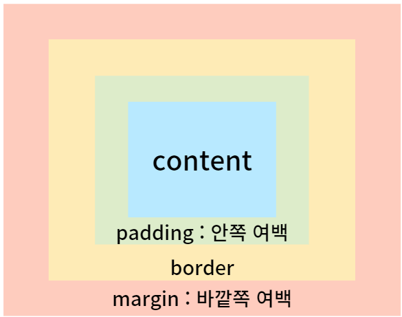
magin
- 바깥의 여백을 설정
- 음수 사용 가능
- auto : 가운데 정렬 가능
margin , 단축 속성
margin : top, right, bottom, left;
margin : top, bottom left, right;
margin : top left, right bottom;
margin : top right bottom left;
margin , 개별 속성
margin-top margin-bottom margin-left margin-right
padding
- 내부의 여백 설정, (=요소의 크기)
- 0 : 내부 여백 없음
- 단위 : px, em, vw
- % : 부모 요소의 가로 너비에 대한 비율 지정
+ padding 단축속성, 개별 속성은 margin과 똑같다.
padding , 단축 속성
padding : top, right, bottom, left;
padding : top, bottom left, right;
padding : top left, right bottom;
padding : top right bottom left;
padding , 개별 속성
padding-top padding-bottom padding-left padding-right
width, height
- auto : 기본값( 요소에 들어있는 속성 값), 브라우저 너비로 계산
- 단위 : px, em, vw 등
- max-width, max-height : 최대 가로/세로 너비
- min-width, min-height : 최소 가로/세로 너비
표현 단위
px : 픽셀
% : 상대적 백분율
em : 요소의 글꼴 크기
rem : 루트 요소(html)의 글꼴 크기
vw : 뷰포트 가로 너비의 백분율
vh : 뷰포트 세로 너비의 백분율
Calc() : 원하는 크기 값 계산
단위가 달라도 계산할 수 있고, 주의할 점은 연산자 사이에는 공백이 있어야 합니다.
line-height
영역 요소 내부 콘텐츠 글자의 줄 높이를 조절할 수 있습니다. box model 의 크기 단위나 font 에도 적용이 가능합니다.
콘텐츠가 1줄인 경우에 box의 height랑 line-height를 동일하게 하면 세로로 중앙 정렬한 효과를 볼 수 있습니다.
<!DOCTYPE html>
<html lang="en">
<head>
    <meta charset="UTF-8">
    <meta http-equiv="X-UA-Compatible" content="IE=edge">
    <meta name="viewport" content="width=device-width, initial-scale=1.0">
    <title>line-height</title>
    <style>
       div{
            width: 30vw;
            height: 10vw;
            line-height: 10vw;
            background-color: coral;
            text-align: center;
        }
    </style>
</head>
<body>
    <div class="calc">세로 중앙 정렬 효과</div>
</body>
</html>
border : width style color;
border-width : border-width는 테두리 선의 두께이고, px, em, %와 같은 단위로 많이 지정한다.
border-width 단축 속성
border-width : top, right, bottom, left;
border-width : top, bottom left, right;
border-width : top left, right bottom;
border-width : top right bottom left;
border-style : 테두리 선의 종류
none: 선 없음
solid : 실선
dashed : 파선
등이 있다.
border-style의 단축속성은 위의 border-width 속성과 다 똑같다.
border-color : 색상지정
black과 같이 색의 이름이나 #fff으로 나타낼 수 있다.
border-color의 단축속성도 똑같다.
실습 문제였던 4방향 테두리 모두 다 다르게 그리기를 해봤다.
<!DOCTYPE html>
<html lang="en">
  <head>
    <meta charset="UTF-8" />
    <meta http-equiv="X-UA-Compatible" content="IE=edge" />
    <meta name="viewport" content="width=device-width, initial-scale=1.0" />
    <title>border-style</title>
    <style>
      .square {
        width: 100px;
        height: 100px;
      }

      .bottom {
        border-bottom-style: double;
        border-bottom-width: 2px;
        border-bottom-color: blue;
      }
      .left {
        border-left-style: dashed;
        border-left-width: 5px;
        border-left-color: red;
        /* border-radius: 5px 15px 25px 45px; */
      }
      .right {
        border-right-style: solid;
        border-right-width: 6px;
        border-right-color: rgb(47, 68, 47);
      }
      .top {
        border-top-style: dotted;
        border-top-width: 3px;
        border-top-color: orange;
      }
    </style>
  </head>
  <body>
    <div class="square right">
      <div class="square top">
        <div class="square bottom">
          <div class="square left"></div>
        </div>
      </div>
    </div>
  </body>
</html>
border-radius : 테두리 둥글둥글하게
0 : 둥글게 없음
px, em, vw 등의 단위로 지정한다.
border-radius의 단축 속성도 똑같다.
위에 테두리 코드에 border-radius: 15px 0px 45px; 를 추가해주면 왼쪽 위에 10px, 오른쪽 아래 45px, 오른쪽 위랑 왼쪽 아래는 0px이 들어간 것을 볼 수 있다.

box-sizing :요소의 크기 계산 기준을 지정한다.
content-box : 요소의 width와 height로 크기 계산합니다. 전체 영역은 border, padding, margin은 따로 계산되어
border-box : 요소의 내용 + padding + border 로 크기 계산합니다. border, padding, margin을 모두 더하기에 설정값보다 작아집니다.
<!DOCTYPE html>
<html lang="en">
  <head>
    <meta charset="UTF-8" />
    <meta http-equiv="X-UA-Compatible" content="IE=edge" />
    <meta name="viewport" content="width=device-width, initial-scale=1.0" />
    <title>Document</title>
    <style>
    .box{
      width: 100px;
      height: 100px;
      padding: 20px;
      border: 15px solid rgb(250, 162, 162);
      background-color: rgb(241, 239, 112);
    }
    .content-box{
      box-sizing: content-box;
    }
    .border-box{
      box-sizing: border-box;
    }
    </style>
  </head>
  <body>
   <div class="box content-box"></div>
   <br/>
   <div class="box border-box"></div>
 </body>
</html>
opacity : 투명도
1 : 불투명
0~1 : 0부터 1사이의 소수점 숫자

요소 숨기는 방법
1. opacity(투명하게) : 모습만 숨기는 법 , 속성 남음, 자리 차지
2. visibility : hidden
- 모습과 속성을 숨기는 법 , 자리 차지
3. display : none
- 그냥 없앰, 자리도 없음
overflow : 내용 넘침 제어
visible : 넘친 거 그대로 보여줌
hidden : 넘치면 자름
auto : 넘치면 스크롤바 생성
개별 속성 : overflow-x / overflow-y
🙈더 공부해야지
블록 이해는 되는데 글로 쓰려니 내가 뭔 말을 한 건지 모르겠다.
css 속성이 이렇게 많았나라는 생각 밖에 안든다.
'[Study] FE > HTML & CSS & JS' 카테고리의 다른 글
| [포스코X코딩온] CSS_05 flex (0) | 2023.03.07 |
|---|---|
| [포스코X코딩온] CSS_04 position & backgound (0) | 2023.03.07 |
| [포스코X코딩온] CSS_02 선택자 (0) | 2023.03.05 |
| [포스코X코딩온] CSS_01 적용 방식 (0) | 2023.03.03 |
| [포스코X코딩온] HTML_02 <table> 태그 & Semantic (0) | 2023.03.03 |